Hello everyone, in this post we will learn how to create a card hover effect in CSS.
Card hover effect:
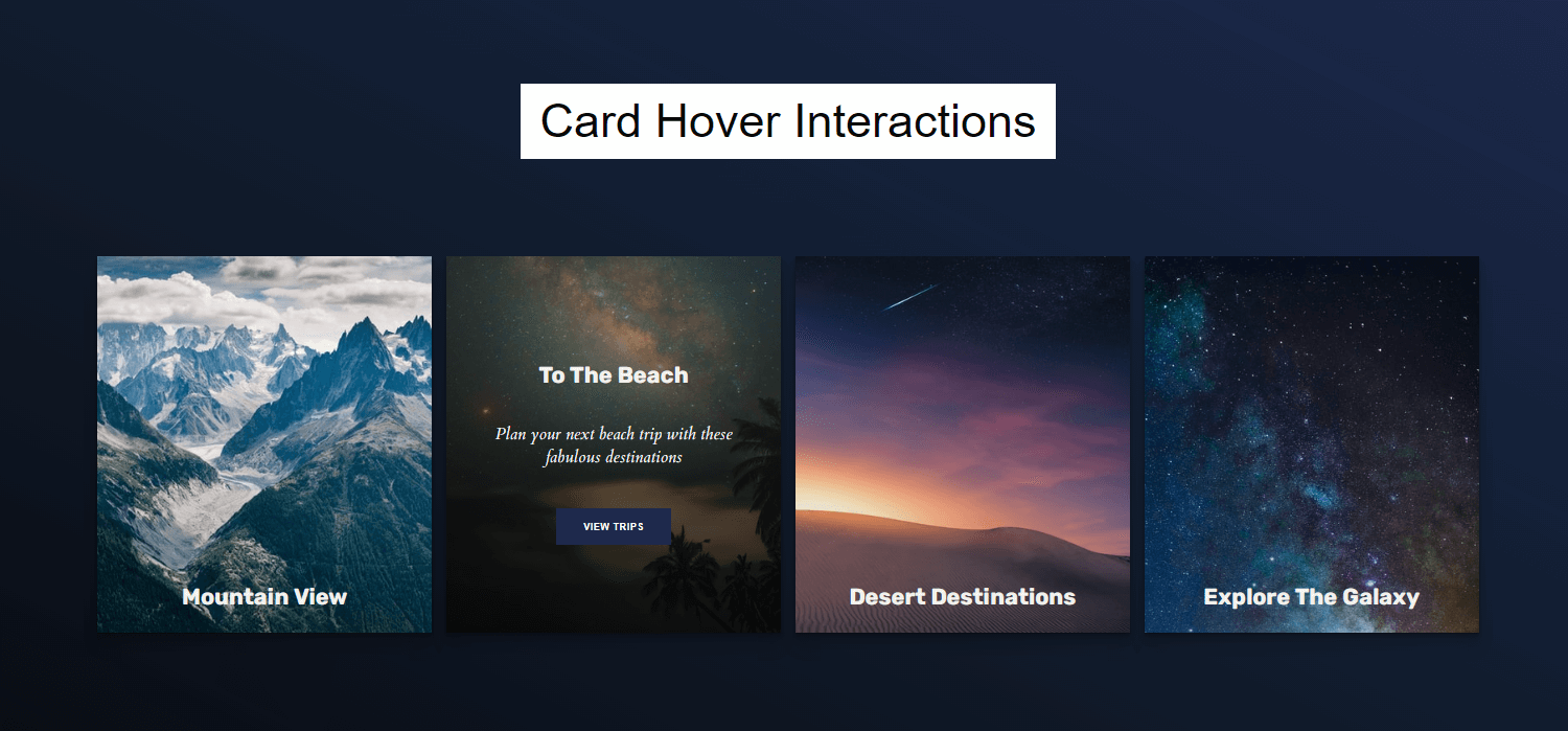
As you can see in the image we have taken a simple background. Then we have taken a heading
and a div below it. Again divided that div into four sections. Provide a picture of each div using the tag in each div part. Pictures must have the same length and height. Then there is padding between all the items and a margin from borders. The pictures appear simply with their title. But after hovering over them they show a beautiful hover effect. The title, description, and button come up after hovering over it. The same effect is applied to each picture.

Boxes have a background shadow and it’s showing all the sides of the box. First, it shows a simple logo but when you hover over it then it shows a beautiful hover effect and it opens the content as well. It opens up with beautiful color and content with a button as well. In the button, we have also added a hover effect.
You might like it:
You can also create this type of design using Html and CSS. For that, you have to follow three basic steps and then you will be able to create it.
How to create a card hover effect in CSS?
First, download a code editor which helps us to write the code for our design. It can be bracketed, vs code, etc.
Source code of Html:
It is a markup language and it is used to create the content of the card including text and buttons. Code is available below for the content of the card Copy this code then paste it into your file of HTML.
<!DOCTYPE html>
<html lang="en" dir="ltr">
  <head>
    <meta charset="utf-8">
    <link rel="stylesheet" href="style.css">
    <title>Card Hover Interactions| FantacyDesigns</title>
  </head>
  <body>

  <h1>Card Hover Interactions</h1>
  <main class="page-content">

    <div class="card">
      <div class="content">
        <h2 class="title">Mountain View</h2>
        <p class="copy">Check out all of these gorgeous mountain trips with beautiful views of, you guessed it, the mountains</p>
        <button class="btn">View Trips</button>
      </div>
    </div>
    <div class="card">
      <div class="content">
        <h2 class="title">To The Beach</h2>
        <p class="copy">Plan your next beach trip with these fabulous destinations</p>
        <button class="btn">View Trips</button>
      </div>
    </div>
    <div class="card">
      <div class="content">
        <h2 class="title">Desert Destinations</h2>
        <p class="copy">It's the desert you've always dreamed of</p>
        <button class="btn">Book Now</button>
      </div>
    </div>
    <div class="card">
      <div class="content">
        <h2 class="title">Explore The Galaxy</h2>
        <p class="copy">Seriously, straight up, just blast off into outer space today</p>
        <button class="btn">Book Now</button>
      </div>
    </div>
  </main>
  </body>
</html>
Source code of CSS:
It is also a markup language that we will use to design our card. We will also create a hover effect with the help of CSS. Its code is given below and you can use it to design your card with the hover effect.
@import url("https://fonts.googleapis.com/css?family=Cardo:400i|Rubik:400,700&display=swap");
:root {
  --d: 700ms;
  --e: cubic-bezier(0.19, 1, 0.22, 1);
  --font-sans: "Rubik", sans-serif;
  --font-serif: "Cardo", serif;
}

* {
  box-sizing: border-box;
}

html, body {
  height: 100%;
background-image: linear-gradient(to right top, #080c11, #0e1520, #111c2e, #16233d, #1d294c);
}

body {
  display: grid;
  place-items: center;
  margin:0px;
}
h1 {
 margin: 0em 0 0.2em 0;
 color:linear-gradient(to right top, #080c11, #0e1520, #111c2e, #16233d, #1d294c);
 font-weight: normal;
 font-size: 50px;
 line-height: 40px;
 font-family: 'Orienta', sans-serif;
 background:#fff;
 padding: 20px;
}

.page-content {
  margin-top: -200px;
  display: grid;
  grid-gap: 1rem;
  padding: 1rem;
  max-width: 1500px;
  font-family: var(--font-sans);

}
@media (min-width: 600px) {
  .page-content {
    grid-template-columns: repeat(2, 1fr);
  }
}
@media (min-width: 800px) {
  .page-content {
    grid-template-columns: repeat(4, 1fr);
  }
}

.card {
  position: relative;
  display: flex;
  align-items: flex-end;
  overflow: hidden;
  padding: 1rem;
  width: 100%;
  text-align: center;
  color: whitesmoke;
  background-color: whitesmoke;
  box-shadow: 0 1px 1px rgba(0, 0, 0, 0.1), 0 2px 2px rgba(0, 0, 0, 0.1), 0 4px 4px rgba(0, 0, 0, 0.1), 0 8px 8px rgba(0, 0, 0, 0.1), 0 16px 16px rgba(0, 0, 0, 0.1);
}
@media (min-width: 600px) {
  .card {
    height: 400px;
  }
}
.card:before {
  content: "";
  position: absolute;
  top: 0;
  left: 0;
  width: 100%;
  height: 110%;
  background-size: cover;
  background-position: 0 0;
  transition: transform calc(var(--d) * 1.5) var(--e);
  pointer-events: none;
}
.card:after {
  content: "";
  display: block;
  position: absolute;
  top: 0;
  left: 0;
  width: 100%;
  height: 200%;
  pointer-events: none;
  background-image: linear-gradient(to bottom, rgba(0, 0, 0, 0) 0%, rgba(0, 0, 0, 0.009) 11.7%, rgba(0, 0, 0, 0.034) 22.1%, rgba(0, 0, 0, 0.072) 31.2%, rgba(0, 0, 0, 0.123) 39.4%, rgba(0, 0, 0, 0.182) 46.6%, rgba(0, 0, 0, 0.249) 53.1%, rgba(0, 0, 0, 0.32) 58.9%, rgba(0, 0, 0, 0.394) 64.3%, rgba(0, 0, 0, 0.468) 69.3%, rgba(0, 0, 0, 0.54) 74.1%, rgba(0, 0, 0, 0.607) 78.8%, rgba(0, 0, 0, 0.668) 83.6%, rgba(0, 0, 0, 0.721) 88.7%, rgba(0, 0, 0, 0.762) 94.1%, rgba(0, 0, 0, 0.79) 100%);
  transform: translateY(-50%);
  transition: transform calc(var(--d) * 2) var(--e);
}
.card:nth-child(1):before {
  background-image: url(https://images.unsplash.com/photo-1517021897933-0e0319cfbc28?ixlib=rb-1.2.1&q=80&fm=jpg&crop=entropy&cs=tinysrgb&w=400&fit=max&ixid=eyJhcHBfaWQiOjE0NTg5fQ);
}
.card:nth-child(2):before {
  background-image: url(https://images.unsplash.com/photo-1533903345306-15d1c30952de?ixlib=rb-1.2.1&q=80&fm=jpg&crop=entropy&cs=tinysrgb&w=400&fit=max&ixid=eyJhcHBfaWQiOjE0NTg5fQ);
}
.card:nth-child(3):before {
  background-image: url(https://images.unsplash.com/photo-1545243424-0ce743321e11?ixlib=rb-1.2.1&q=80&fm=jpg&crop=entropy&cs=tinysrgb&w=400&fit=max&ixid=eyJhcHBfaWQiOjE0NTg5fQ);
}
.card:nth-child(4):before {
  background-image: url(https://images.unsplash.com/photo-1531306728370-e2ebd9d7bb99?ixlib=rb-1.2.1&q=80&fm=jpg&crop=entropy&cs=tinysrgb&w=400&fit=max&ixid=eyJhcHBfaWQiOjE0NTg5fQ);
}

.content {
  position: relative;
  display: flex;
  flex-direction: column;
  align-items: center;
  width: 100%;
  padding: 1rem;
  transition: transform var(--d) var(--e);
  z-index: 1;
}
.content > * + * {
  margin-top: 1rem;
}

.title {
  font-size: 1.5rem;
  font-weight: bold;
  line-height: 1.2;
}

.copy {
  font-family: var(--font-serif);
  font-size: 1.125rem;
  font-style: italic;
  line-height: 1.35;
}

.btn {
  cursor: pointer;
  margin-top: 1.5rem;
  padding: 0.85rem 1.8rem;
  font-size: 0.65rem;
  font-weight: bold;
  letter-spacing: 0.025rem;
  text-transform: uppercase;
  color: white;
  background-color: #1D294C;
  border: none;
}
.btn:hover {
  background-color: #fff;
  color:#1D294C;
  font-weight:500;
}
.btn:focus {
  outline: 1px dashed yellow;
  outline-offset: 3px;
}

@media (hover: hover) and (min-width: 600px) {
  .card:after {
    transform: translateY(0);
  }

  .content {
    transform: translateY(calc(100% - 4.5rem));
  }
  .content > *:not(.title) {
    opacity: 0;
    transform: translateY(1rem);
    transition: transform var(--d) var(--e), opacity var(--d) var(--e);
  }

  .card:hover,
.card:focus-within {
    align-items: center;
  }
  .card:hover:before,
.card:focus-within:before {
    transform: translateY(-4%);
  }
  .card:hover:after,
.card:focus-within:after {
    transform: translateY(-50%);
  }
  .card:hover .content,
.card:focus-within .content {
    transform: translateY(0);
  }
  .card:hover .content > *:not(.title),
.card:focus-within .content > *:not(.title) {
    opacity: 1;
    transform: translateY(0);
    transition-delay: calc(var(--d) / 8);
  }

  .card:focus-within:before, .card:focus-within:after,
.card:focus-within .content,
.card:focus-within .content > *:not(.title) {
    transition-duration: 0s;
  }
}
Download source code:
Source code is available in the form of a folder and it has all the necessary things which are required to create this type of hover effect. So, the download link is given below.
Task:
After hovering over the image the content appears from bottom to top. Now you have to change the animation style. After hovering over it, it appears its animation from top to bottom.
I hope it was a helpful post for all of you. If you like our design then must follow us so that you can learn more things related to Html, CSS, and javascript.
Thanks for reading this post.
[su_divider divider_color=”#1DBF73″ link_color=”#1DBF73″]
[su_button id=”download” url=”https://mega.nz/file/Nkl2GYST#RIm8VlwWps0JoYIHg7x8P9YSyDMBKhqgVVIaOEqrSqc” target=”blank” style=”3d” background=”#1DBF73″ size=”6″ radius=”5″ icon=”icon: download” desc=”Click to Download” ]Download Source Code[/su_button]


